A burndown chart or burn down chart is a graphical representation of outstanding work plotted against time. The exceptional work is often on the vertical axis and can be measured in hours, story points, function points, with time along the horizontal axis. The chart is mainly used for investigating to what extent the project is on track. In Scrum, the breakdown chart plays a very crucial role for the Scrum Team and Scrum Master landing the sprint.
In the following, we will investigate how the breakdown chart is used in a Scrum sprint. A scrum sprint covers typically two weeks, in other words, ten workdays where the first day is used for demo, retrospective, estimation and planning and the rest for executing tasks.
During the planning session, the Product Owner brings the User Stories, which he wants the Scrum Team to develop. Together, they will investigate and estimate the presented User Stories in Story Points. Based on the team’s productivity knowledge, also called velocity, and the estimates carried out, the team and the Product Owner will decide what User Stories will be developed in the sprint. In most cases, the team will do further breakdowns where tasks will be estimated in hours. And hopefully, the sum of hours of the estimated will match the hours availably in the sprint. That way, it becomes a sanity check for the team, ensuring that they can handle it within the sprint. In theory, this makes sense, but there are always uncertainties in the real world. Not all Agilist supports estimates in hours, but it works pretty well in some cases.
During estimation, the knowledge of the effectiveness of the team is essential; this key metric usually is named velocity – but what is velocity? It measures the amount of work a team can deliver during a sprint. Velocity is calculated from experience and must be recalculated every time sprint has ended because of differences in sprint content and availability of work hours. When executing more and more sprints, the velocity will become more stable.
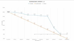
The figure shows a burndown for a sprint. The orange curve is the ideal burndown. But it is seldom that the sprint burndown follows this curve, normally the burndown will be slow at the beginning and speed up later in the sprint. As you can see from the chart, some activities prevent the sprint from finalising. The consequences will be that the team will not succeed as expected, and some work must be carried out in the next sprint when the blocking is removed. In the worst case, the team will be idle, waiting for a decision to remove the. The case shows the importance of getting blocks away and, in other words having an effective escalation process.